Designing Mobile-Friendly Restaurant Websites

Table of Contents
- Why Is Mobile Friendliness A Non-Negotiable For Restaurant Websites?
- Steps To Design A Mobile-Friendly Restaurant Website
- Creating A Simplified Navigation & User Interface
- Optimising Speed For Customers On-the-Go
- Using High-Quality Images Within A Minimalistic Design
- Ensuring Seamless Menu Accessibility
- Ready To Create A Mobile-Friendly Website For Your Restaurant?
If you ask any web design specialist about marketing for restaurants, they’ll tell you that mobile-friendly websites are crucial to their success. But why is that?
Well, you know that awkward feeling you get when you’re heading to a restaurant for the first time? You want to be sure that you’ll find something on the menu that you’ll like.
We’ve all been there.
What do you do in this situation? You’ll probably grab your phone and quickly search for the restaurant’s website before opening their menu.
Those first few seconds when the user interacts with your website can have a big impact on how your restaurant presents itself. You could have the finest dishes in the area, but if it’s difficult for the user to find your menu and see clear images of your food, you risk losing them as a customer. And that’s just the tip of the iceberg.

Why Is Mobile Friendliness A Non-Negotiable For Restaurant Websites?
There’s no two ways about it. All restaurants should invest in their online presence because it’s their best chance of connecting with their potential customers. Most restaurants rely on customers from their local community, and consumers tend to favour businesses that are nearby. That’s why Google “near me” searches have increased by 250% in the past two years.
Central to these localised searches are Google My Business (GMB) profiles. 86% of customers use these helpful pages allow users to locate businesses that are close to them on a local map. The success of GMB profiles is no secret either, with claimed profiles gaining 7 times the amount of clicks that unclaimed profiles receive.
You might now understand why it’s important for restaurants to invest in their online presence, and a quality website is crucial to these efforts. But you might not understand why it’s important for these websites to be mobile-friendly. Well, if you’re looking for an answer, the numbers speak for themselves.

The “Restaurant Study” conducted by Google and Numerator in 2019 revealed that a whopping 89% of all dining research was conducted on mobile phones before visiting a restaurant. In other words, almost 9 of every 10 customers who research a restaurant prior to visiting will use their phone to see what they offer.
Quite clearly, there’s very little purpose in investing in quality website design services if they don’t offer your users a mobile-friendly experience. But what is a mobile-friendly experience, and how can your chosen web designers ensure that your website is optimised for smartphone users from the outset?
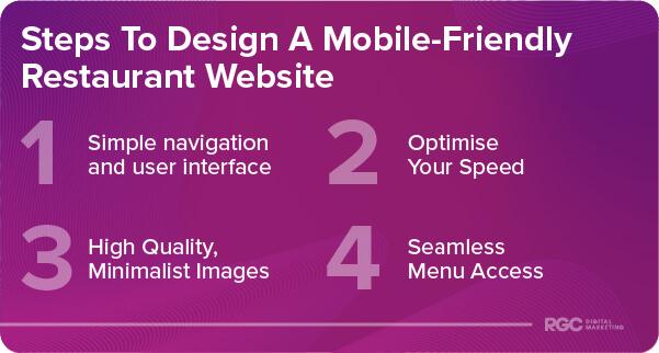
Steps To Design A Mobile-Friendly Restaurant Website

Creating A Simplified Navigation & User Interface
One of the easiest ways to ensure your website is mobile-friendly is by carefully considering its navigation. Picture this: Your customer is already late for a dinner reservation and they’re in that frantic situation trying to find your precise location and your menu.
Complex menus and a cluttered interface are a nightmare for mobile users and can deter them from interacting with your website entirely. So, keep it simple. Opt for a hamburger menu or easy-to-spot tabs.
A clean, straightforward navigation design not only reduces bounce rates but also enhances the overall user experience. Better still, Google loves websites that users love—meaning you’re also likely to experience an improvement in your search engine rankings.
Optimising Speed For Customers On-the-Go
Speed is crucial for all websites, especially those of restaurants that have multiple competitors. Imagine your customer’s frustration as they sit through a seemingly endless loading screen, just to glimpse your special of the day. To crank up your website’s speed, start by optimising your images; big, bulky files aren’t conducive to quick loading times. Use image compression tools or change the format to something more web-friendly like JPEG.

You might also consider using caching services. Hosting your website on a server that’s local to your restaurant can also have a great impact on your site speed and keep your viewers engaged. Finally, you can speak to your web development team about minimising your code. Unnecessary characters in your HTML, CSS, and JavaScript can slow down your site’s loading speed.
A faster-loading website is crucial to improving visitor retention, and it is also a known metric in Google’s Search Engine Optimisation (SEO) algorithm. In simple terms, a fast site boosts your search engine rankings, making you more visible to potential customers.
Using High-Quality Images Within A Minimalistic Design
When it comes to displaying your food online, you might think a picture is worth a thousand words. High-resolution images can make sure your visitors know just how delicious your meals are. However, a balance must be struck.
Although your high-resolution images are important, they often come with large file sizes that can slow down your website. Use image optimisation tools to compress these files without sacrificing quality. How you use these images is equally important. Stick to a minimalistic design that allows your high-quality images to shine without overwhelming the visitor.
Combining high-quality, fast-loading images with a minimalist design not only improves user engagement but also enhances your site’s performance. Your pages load faster, which can contribute to improved SEO rankings. Plus, the clean design keeps the focus where it should be: on your delicious food.

Ensuring Seamless Menu Accessibility
The menu is the heart of any restaurant website, and hiding it in the corner of your webpage is like hiding the silverware—you’re making it hard for people to enjoy what you have to offer. Position your menu clearly on the homepage and consider using sticky navigation features so that it remains accessible as users scroll down.
Make your menu mobile-responsive, and offer it in multiple formats, such as PDF and HTML, so it’s easily viewable on various devices. You could also add an intuitive search function to the menu for those who know exactly what type of dish they’re after.
Ensuring your menu is easy to access keeps users engaged and increases the time they spend exploring your culinary options. This can translate into a higher conversion rate, where website visits turn into actual reservations or orders. An easily navigable menu can improve your overall customer experience, encouraging repeat visits both to your site and to your restaurant.
Ready To Create A Mobile-Friendly Website For Your Restaurant?
Now that you understand why a mobile-friendly website is important for restaurants, you might be wondering why you didn’t create one sooner. Follow these simple steps, and you’ll be well on your way to optimising your website for mobile users.
Don’t underestimate the power of a mobile-friendly design; it’s an investment in your restaurant’s future, expanding your reach and increasing your customer satisfaction. By taking action now, you’ll be ensuring you stay ahead of the curve and offer a quality experience for your customers both online and in person. For specialist assistance in creating your restaurant’s website, be sure to reach out to an experienced web design team today.


